
The power of nature in moodboards is something I’ve come to appreciate every time I sit down to plan a new creative project. I used to overlook just how much impact natural colors, textures, and themes could bring to a design, but once I started using them intentionally, everything shifted.
A simple palette inspired by the forest, or even the soft tones of coastal landscapes, instantly gave my boards more depth and personality. I’ve found that nature doesn’t just make a moodboard look more beautiful—it makes it feel more alive.
For example, swapping in earthy browns or leafy greens completely changed the tone of my work and gave it a sense of calm I hadn’t managed before. These small details create a connection between the board and the viewer, which is why I now lean on nature whenever I need a fresh spark of inspiration.
“Look deep into nature, and then you will understand everything better.”
— Albert Einstein
Nature Vibes That Supercharge Your Moodboard
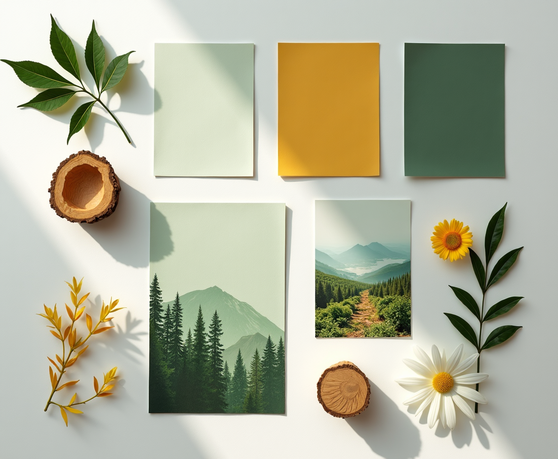
Nature has a way of adding instant energy to a moodboard. Incorporating outdoor elements like greenery, sunlight, or earthy landscapes can shift the tone of a board from flat to vibrant. These visuals carry strong emotional cues—lush leaves suggest freshness, while open skies suggest freedom.
By layering in images that mirror the vitality of nature, moodboards immediately feel more dynamic and engaging.
Green Magic: Moodboards You’ll Want to Save
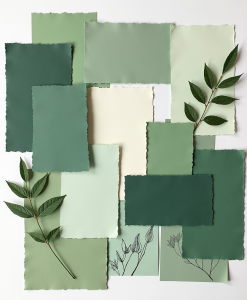
Green is one of the most versatile colors when building moodboards. Soft sage tones bring a calming and balanced atmosphere, while bright emerald creates a sense of vibrancy and renewal.
Different shades of green reflect growth, harmony, and life, making them a strong foundation for creative boards. Using green intentionally allows the design to feel connected to both serenity and creativity at the same time.
Wild Textures to Spark Your Next Board
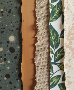
Textures from the natural world bring a tactile dimension to moodboards. Rough stone, smooth wood, or delicate leaves add variety that flat colors can’t achieve.
By mixing these wild textures, a board instantly feels layered and full of depth. This sensory detail encourages creativity and helps projects stand out visually.
Calm Colors: Nature Palettes That Pop
Nature offers an endless palette of calming tones that still manage to stand out. Soft blues echo open skies, muted purples reflect twilight, and sandy neutrals recall quiet coastlines.
When used on a moodboard, these shades deliver both serenity and visual interest. They create balance by soothing the eye while still drawing attention to key details.
Forest to Feed: Moodboard Ideas That Flow
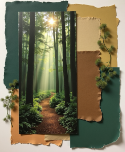
Forests inspire moodboards that feel grounded and nourishing. Deep greens, rich browns, and dappled light tones mimic the layered feel of walking through trees.
These boards carry a natural flow, guiding the viewer’s eye the way a forest path leads forward. The combination of earthy shades and organic patterns reinforces stability while also sparking creativity.
Leafy Layers for Instant Aesthetic Zen
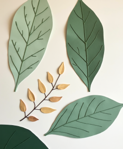
Leaf shapes and patterns bring harmony to a moodboard with very little effort. Large tropical leaves suggest boldness, while delicate ferns suggest calm.
Overlapping these leafy motifs creates a layered effect that mirrors nature’s own design. This technique instantly delivers a sense of zen, making the overall board feel more cohesive and aesthetically pleasing.
Sunlit Palettes That Lift Your Mood
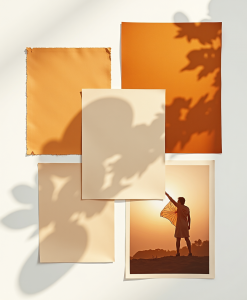
Light-inspired palettes instantly brighten a moodboard. Golden yellows, warm oranges, and soft creams mimic the warmth of morning or evening sun.
These shades bring optimism and positivity, making a board feel inviting. The gentle glow of sunlit tones adds an uplifting energy that enhances the overall mood.
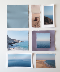
Coastal Calm: Build a Board in Minutes
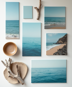
Coastal themes give moodboards an effortless sense of peace. Blues from the ocean, whites from sandy shores, and soft grays from driftwood work beautifully together.
These elements create a clean and refreshing aesthetic that feels light and open. A coastal-inspired board naturally carries calmness and clarity, perfect for projects that need a soothing atmosphere.
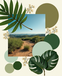
Botanical Boosts Your Board Is Missing
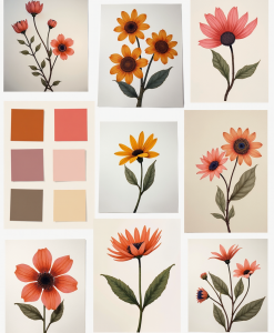
Botanical touches add life to any moodboard. Floral patterns, garden-inspired motifs, or simple sprigs of leaves inject freshness without overwhelming the design.
These details connect the viewer to organic beauty and subtle elegance. Even minimal botanical additions can transform a plain board into one that feels vibrant and inspired.
Earthy Tones, Big Feelings
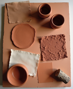
Earth-inspired tones ground a moodboard with warmth and depth. Shades of terracotta, clay, and deep soil bring a sense of stability and connection.
These colors often carry emotional weight, evoking feelings of comfort, authenticity, and resilience. When combined with natural textures, earthy tones give boards a timeless quality that resonates strongly with viewers.
“In every walk with nature one receives far more than he seeks.”
— John Muir
Nature’s Touch, Creative Flow
- Start with one small nature-inspired detail—like a leaf pattern or earthy tone.
- Use calming palettes to balance bold ideas and create visual harmony.
- Layer textures such as wood, stone, or greenery for added depth.
- Experiment with seasonal influences: sunlit tones, coastal shades, or forest hues.
- Focus on consistency—let nature guide the overall flow of your moodboard.
Tapping into the power of nature in moodboards has shown me just how transformative simple elements can be. Natural palettes, textures, and motifs carry emotions that instantly change the way a board feels.
Greens bring harmony, sunlit shades lift the mood, and earthy tones provide grounding. These details are small on their own, but together they create designs that feel alive and connected.
What excites me most is how easy it is to bring these ideas into practice. Adding a leafy pattern, swapping in coastal blues, or layering wild textures doesn’t require a full redesign—it’s about making thoughtful choices.
Each step builds momentum toward boards that inspire and resonate.
If you’re ready to elevate your creative work, start with one nature-inspired detail today. Over time, these subtle changes will flow into a style that not only looks beautiful but also feels deeply meaningful.
Which nature-inspired element will you experiment with on your next moodboard?